

04 — AutoScout24 · SMG
Magazine / Guide
Live · guide.autoscout24.ch
Redesigned the link between content and commerce: guides that build trust and take users seamlessly from the article into the marketplace.
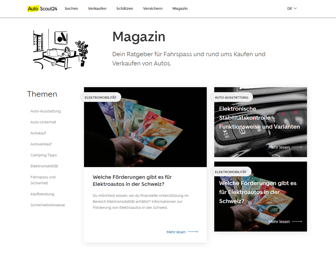
Guide homepage: topics, entry, editorial surface.
- Role
- Senior product designer
- Timeline
- SMG · AutoScout24 Switzerland
- Duration
- Concept to launch
- Team
- Product, content, design system
- Platform
- Web · guide.autoscout24.ch
Live
guide.autoscout24.ch
Käufer + Verkäufer
Two readers, one IA
DS
Anchored in the design system
Context
A magazine that belongs to the marketplace — without copying it.
Beside the listing, AutoScout24 needed an editorial place: guides, tests, buying advice. I owned concept, content architecture and the experience from homepage to article. The magazine had to sit in the design system and still feel editorially its own.
Problem
Trust and transaction in one breath.
- 01
Inform without selling — and the reverse
Readers should stay. Buyers should find. Both in the same system, without one eating the other.
- 02
Two readers, one architecture
Buyers and sellers ask different questions. Navigation must not show that as chaos.
- 03
System versus editorial character
Too close to the marketplace and the magazine reads as ads. Too far and the brand breaks.
What we did not build
Guide first. Marketplace after.
- 01
Not a magazine that only sells listings
Readers should stay. Help stands before the offer. Otherwise the transaction eats the trust.
- 02
One IA, two readers
No separate worlds for buyers and sellers. Navigation shows two questions, not two products.
- 03
Type and structure before campaign
Whitespace and IA moved more here than a hero video. The guide should hold, not advertise.
Role
Concept, architecture, surface.
I developed the magazine visually, defined the content structure and drew the journey from entry to article — inside the existing AutoScout24 design system, with its own editorial register.
- Content architecture and topical sections
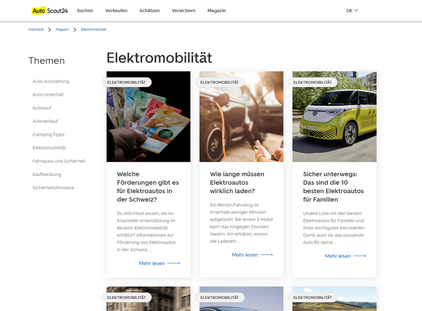
- Home, section and article templates
- Contextual vehicle offers
- Design-system integration, own tone
Process
Guide character, not magazine décor.
- 01
Cut the sections
Buying advice, tech, law, selling — so orientation takes three seconds.
- 02
Build templates
Home, section, article. Repeatable for editorial, not as one-offs.
- 03
Link the marketplace
Matching listings beside the guide. Help first, offer after.
- 04
Typography as trust
Whitespace, serif calm, image run. Seriousness you do not have to claim.
Insight
The guide is a product, not a blog.
Editorial quality is UX here: those who trust the advice trust the listing.
Hence the strict architecture, the quiet surface, contextual offers instead of banners. The magazine should feel like expertise — and keep the path into the marketplace open.
Solution
A guide that actually helps.
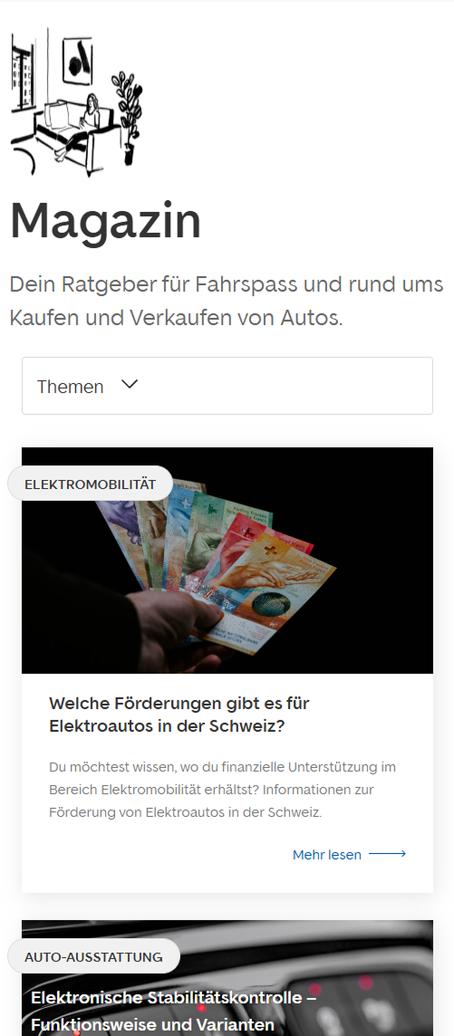
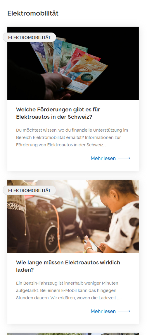
Clear categories for buyers and sellers. Articles with typography that carries expertise. Navigation that joins magazine and marketplace without confusing them. Live at guide.autoscout24.ch.
Impact
A guide with its own character, inside the platform system.
The magazine is up. It has sections, templates and a link into the marketplace that stays editorial. For recruiters: this is content strategy as product work, not as a campaign.
Live
guide.autoscout24.ch
Käufer + Verkäufer
Two readers, one IA
DS
Anchored in the design system
Reflection
Keep
Treat editorial as a UX discipline. Typography and IA moved more here than a hero video.
Do differently
Define success with content from the start — not once the guide is live.