

03 — 20 Minuten · TX Group
20 Minuten NOW
NOW live · one logic, iOS + Android
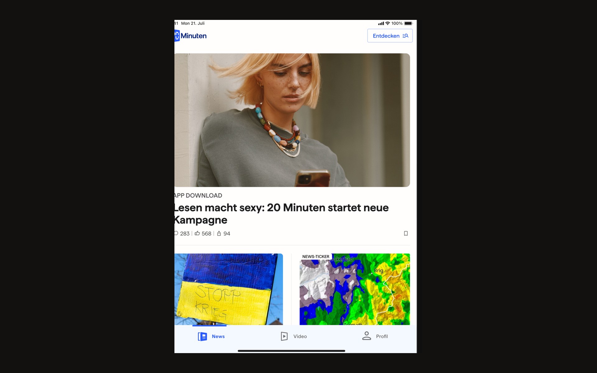
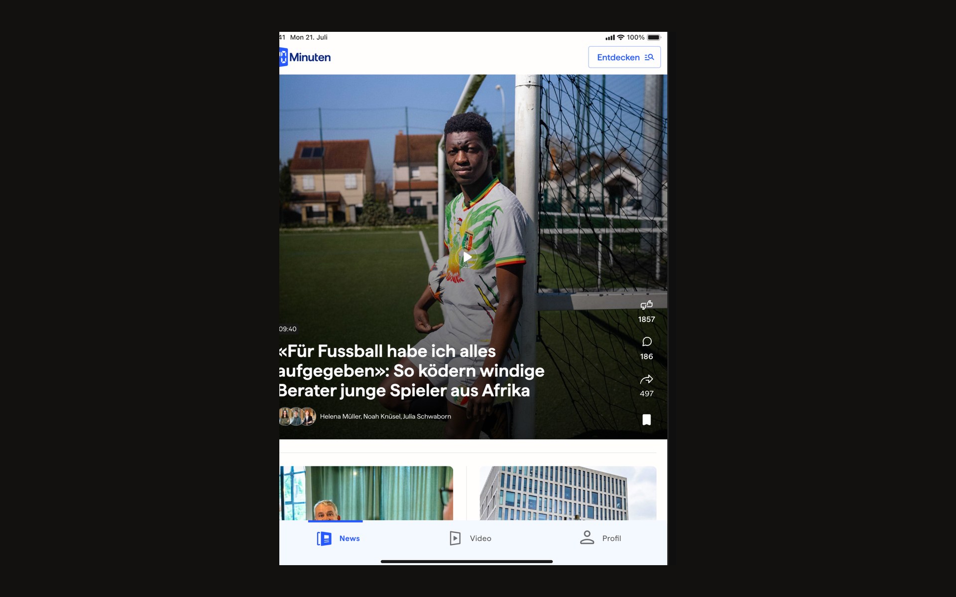
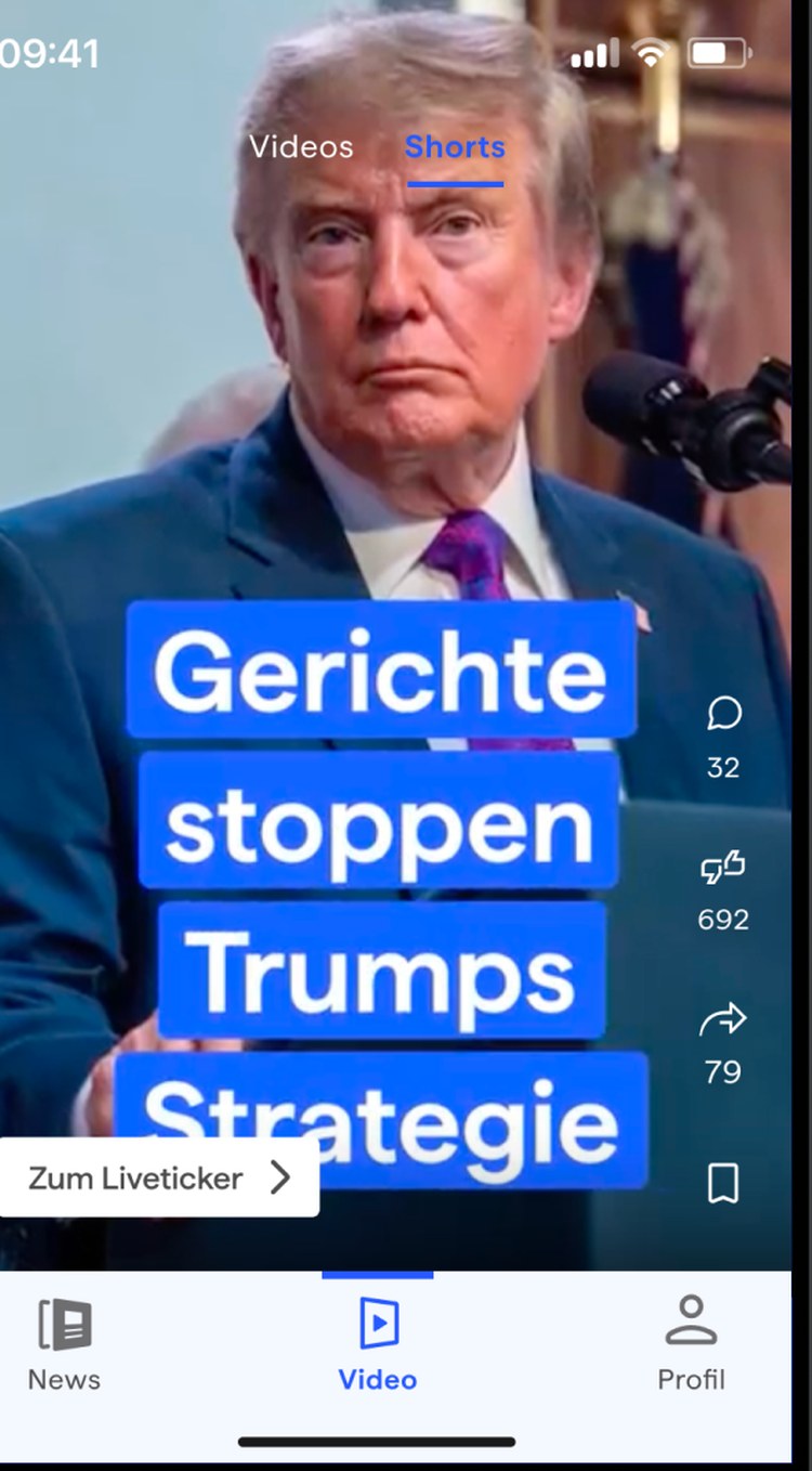
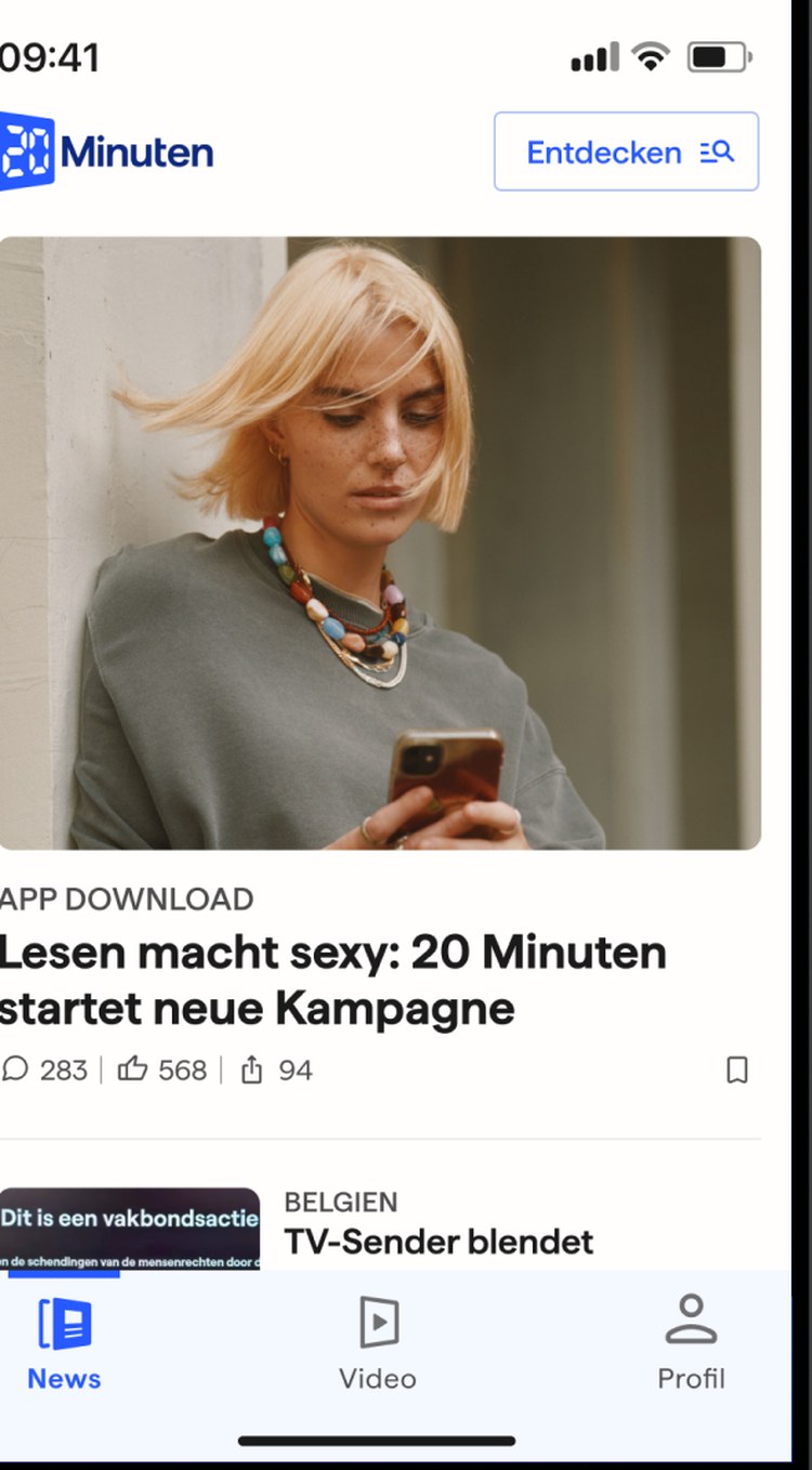
From wireframes to the live product: designed feed, article and 20min NOW — a new format for short vertical video news, integrated directly into existing articles.

News on the move. App screens follow in the case.
- Role
- UX designer
- Timeline
- 2019 — 2020
- Duration
- App & NOW product cycle
- Team
- Product, editorial, engineering
- Platform
- iOS & Android
iOS + Android
One logic, two systems
NOW
Format launched
Mio.
Brand reach
Context
News on the move, in seconds.
20 Minuten is Switzerland’s most-read newspaper. For millions the app is the daily entry — with extreme demands on speed, clarity and readability on small screens. 20min NOW arrived on top: short mobile video news to swipe, pause, and tip into the article.
Problem
Attention is not a metaphor here.
- 01
Density versus pace
People decide in seconds whether a story matters. Slow loads and unclear hierarchy are not UX sins. They are an exit.
- 02
A new consumption model
NOW is not the feed with video. It is its own device: vertical, swipeable, with a seamless shift into text.
- 03
Performance as a feature
Weak networks, older Android devices. Prototypes had to show real-world pace, not studio pace.
What we did not build
Pace over density. Device over speculation.
- 01
Less hierarchy, more seconds
A feed that lets people decide in seconds. Density that costs pace is drop-off here, not richness.
- 02
Prototypes on the device
With editorial in the session, not only in Figma. Speculation about gestures shortens as soon as you swipe.
- 03
Performance as a design constraint
Weak networks and older Android devices sit in the surface, not only in QA.
Role
From sketch to tested prototype.
I owned concept and detailing of the core flows — with a focus on NOW. Research and heatmaps of the existing app, lo-fi, hi-fi in Figma, tests with editorial and product.
- Review of existing news apps, interviews, heatmaps
- User flows for feed, article and the video format
- Hi-fi wireframes and prototypes for iOS and Android
- Usability tests, iteration with editorial and product
Process
Mobile first, radically reduced.
- 01
Read what is already there
Existing app, competitors, heatmaps. Do not invent the format before the current state is understood.
- 02
Flows before screens
Feed, article, NOW, back. The gesture had to land before the surface was dressed.
- 03
Prototype as argument
Clickable, on-device, in editorial’s hand. Discussions got shorter.
- 04
Two platforms, one behaviour
Respect iOS and Android defaults without building two products.
Insight
NOW needs its own room.
Push video into the feed and you get drop-off. Give it its own player and you get a format.
Thumb zone, large targets, little text. NOW as a dedicated player with swipe, an immediate shift to the article, no forced interruption. Performance was part of the concept, not a ticket afterwards.
Solution
An app frame that matches the pace of news.
A clear hierarchy in the feed, a reading view that holds on small screens, and NOW as its own experience. The format launched — today it continues in the app as vertical video (Shorts), with swipe and a jump into the article.
Impact
NOW did not stay a prototype.
The format went live and is now part of the app’s standing repertoire. Strong use of the short video formats — carried by a UX that does not get in the way of news.
iOS + Android
One logic, two systems
NOW
Format launched
Mio.
Brand reach
Reflection
Keep
On-device prototypes, with editorial in the session. That shortened speculation.
Do differently
Set performance budgets as a design constraint even earlier, not as a QA topic.